
Timeless Graphic Tee Design Tips for 2026
Table of Contents
- What Makes a Graphic Tee Design Timeless
- Graphic Tee Design Trends for 2026
- Color Palettes That Stand the Test of Time
- Typography-Driven Design Strategies
- How to Wash Graphic Tees to Preserve Design Quality
- Niche-Specific Design Strategy and Self-Expression
- Frequently Asked Questions
Last Updated: August 30, 2026
What Makes a Graphic Tee Design Timeless
A timeless graphic tee design combines visual elements that transcend seasonal trends while maintaining contemporary relevance. The distinction between a design that fades within months and one that remains relevant years later comes down to intentional choices across concept depth, visual hierarchy, color restraint, and technical execution.
The most enduring graphic tee designs communicate something genuine about the wearer's identity or values without relying on fleeting trends. This means anchoring design decisions in principles with demonstrated longevity while selectively incorporating contemporary elements that enhance rather than define the piece.
Awake Republic approaches graphic tee design with this philosophy at its core. The brand's original designs, from bold American symbolism to custom pet artwork, prioritize visual clarity and conceptual substance over trend-chasing. Each design sparks conversation and expresses self-identity, qualities that inherently resist dating themselves.
Balancing Current Trends with Lasting Appeal
The tension between trend and timelessness defines modern graphic tee design. Trends provide visual currency; timelessness ensures wearability five years forward. The balance lies in understanding which trend elements have structural staying power versus which are purely aesthetic flourishes.
Current design movements, minimalism, retro revival, nature-inspired elements, sustainable messaging, reflect genuine shifts in consumer values and visual literacy. A design incorporating these thoughtfully will feel contemporary without becoming dated. Minimalist layouts with restrained color palettes have proven durable; neon color palettes cycle more predictably.
Technical execution directly impacts longevity. Quality specialty inks and proper file preparation maintain visual integrity through dozens of washes. Poor print quality ages visibly and rapidly, making even conceptually strong designs feel cheap within months.
Graphic Tee Design Trends for 2026
The graphic tee design landscape in 2026 reflects maturation of design thinking. Rather than radical departures, 2026 trends represent refinement of movements that have gained cultural traction.
Nostalgic and Retro Aesthetics
Retro design elements continue to dominate because they tap into genuine cultural memory while offering visual relief from digital oversaturation. The distinction between retro that ages well and retro that feels forced lies in authenticity. Designs referencing actual historical movements maintain relevance; generic "retro vibes" without specific reference points date more quickly.
The most successful retro-inspired designs blend period elements with contemporary sensibility. A 70s-influenced color palette paired with modern typography feels fresh rather than costume-like. Specificity matters: a design referencing a particular decade or cultural moment carries more narrative weight than generic retro styling. Awake Republic's approach, incorporating American symbolism with historical depth, exemplifies how nostalgia becomes substantive.
Minimalist vs. Maximalist Approaches
Minimalist designs rely on restraint, negative space, and singular focal points. A single bold icon or carefully chosen typography carries the entire visual weight. Maximalist designs embrace complexity, layering, and detail.
Both approaches achieve timelessness through different mechanisms. Minimalist designs age well because they emphasize clarity and concept over decoration. Maximalist designs succeed when visual complexity serves a purpose, telling a story or conveying intricate ideas. The choice should align with the design's core message. A patriotic statement benefits from minimalist clarity; a narrative design like Awake Republic's Rocking Dragons tee, featuring a full band composition with sunset and palm trees, requires maximalist density where every element contributes to the overall story.

Nature-Inspired and Sustainable Design Elements
Nature-inspired imagery has moved beyond aesthetic preference into philosophical territory. Consumers increasingly seek designs reflecting environmental consciousness and connection to natural systems. This shift creates designs with built-in longevity because they align with values showing no signs of reversal.
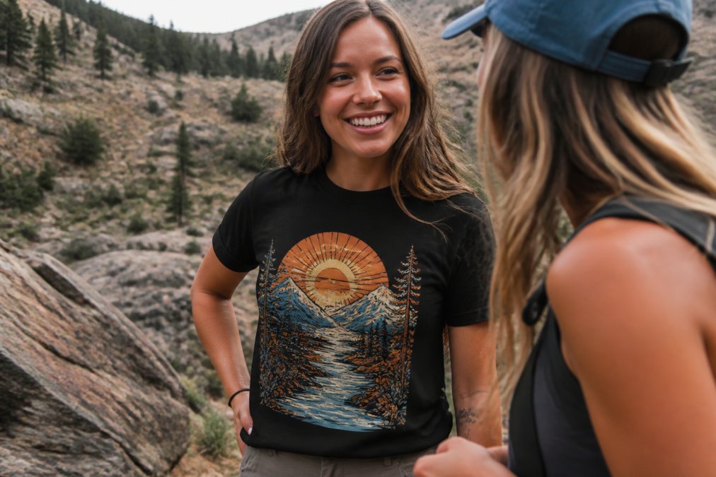
Sustainable design elements encompass both visual approach and production method. Designs celebrating environmental themes pair naturally with sustainable printing practices, organic cotton, and responsible manufacturing. The most effective nature-inspired designs avoid generic imagery. A stylized crocodile with personality, botanical patterns referencing specific plants, or landscape compositions telling a story outperform abstract nature motifs.
Color Palettes That Stand the Test of Time
Color choice represents one of the most consequential decisions in graphic tee design because color carries both aesthetic and psychological weight.
Pastels, Neon, and Bold Contrast
Pastel color palettes have shown consistent appeal because they read as approachable and contemporary without feeling trendy. Pastels age more gracefully than saturated colors because they don't announce themselves as products of a specific moment.
Neon and high-saturation colors command immediate attention but cycle more predictably. Neon used as accent elements rather than dominant colors creates visual hierarchy that survives trend cycles better than monochromatic saturation. The most durable color strategies employ restraint: a limited palette of three to four colors maximum maintains visual clarity. Each color choice should serve a purpose rather than exist as decoration. Awake Republic's designs demonstrate this principle through bold color choices that enhance the message rather than overwhelm it.
Typography-Driven Design Strategies
Typography-driven designs place text at the visual center, making font selection and treatment critical to both immediate impact and long-term relevance. Serif fonts carry historical weight; sans-serif fonts feel contemporary and clean. Script and decorative fonts add personality but date more quickly. The most timeless typography designs combine type families, a bold sans-serif headline paired with readable body text.
How to Wash Graphic Tees to Preserve Design Quality
The lifespan of a graphic tee extends far beyond initial purchase. Proper care determines whether a design remains vibrant or fades and cracks within months.
Protecting Against Cracking and Fading
Design degradation occurs through fading (color loss) and cracking (ink separation from fabric), both resulting from heat, friction, and harsh chemicals. Cool or cold water washes extend design life substantially (the FTC). Hand washing in cool water provides maximum protection; machine washing in cold water with gentle cycles offers reasonable protection.
Gentle, dye-free detergents designed for delicate fabrics provide better protection than standard detergents. Avoid fabric softeners and bleach entirely. Air drying, hanging or laying flat, preserves design integrity far more effectively than machine dryers. Wearing a graphic tee multiple times before washing reduces overall stress on the design. Turning the shirt inside-out provides additional protection by reducing direct friction.
Niche-Specific Design Strategy and Self-Expression
The most memorable graphic tees communicate something specific about the wearer's identity, values, or interests. Generic designs achieve minimal emotional connection; niche-specific designs create belonging and self-expression.
Niche design strategy begins with understanding the target audience's values, aesthetics, and communication style. Awake Republic's approach demonstrates this principle across multiple audiences. Designs celebrating American independence resonate with one niche; custom pet designs serve another entirely. Each design speaks directly to its intended audience's sense of identity.
Authenticity matters more than polish in niche design. An imperfectly executed design genuinely representing a community's values outperforms a slick design feeling corporate or inauthentic. The most successful niche designs incorporate inside references, specific terminology, or visual language signaling community membership while remaining accessible to newcomers.
Graphic tee design that stands the test of time balances artistic vision with technical competence, trend awareness with timeless principles, and broad appeal with niche authenticity. The designs that endure communicate something genuine about the wearer's identity or values while maintaining visual clarity and production quality.
Awake Republic's collection of original graphic tees demonstrates how this balance creates designs worth keeping. The brand's commitment to bold American symbolism, custom pet designs, and thoughtful artistic execution means each piece serves as a conversation starter and self-expression vehicle.
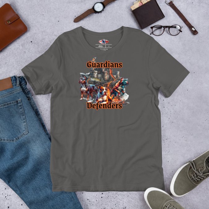
Awake Republic® Pit Bull Guardians and Defenders T-Shirt (100% Cotton)
Frequently Asked Questions
What makes a graphic tee design truly timeless?
Timeless graphic tee designs balance strong visual hierarchy with restrained color choices, avoiding trends that date quickly. Focus on meaningful imagery—whether bold American symbolism, nature-inspired elements, or hand-drawn aesthetics—rather than celebrity faces or dated slang. Quality typography paired with clean layout ensures the design remains relevant across years. The best timeless designs communicate a clear message without relying on trendy effects like gradients or oversized logos that fade from fashion.
How should I balance 2026 graphic tee design trends with timeless appeal?
Select one trend element—such as retro aesthetics, minimalist layout, or sustainable themes—and anchor it with timeless fundamentals: solid color palettes, legible typography, and meaningful imagery. Avoid combining multiple competing trends. For example, pair a nature-inspired graphic with a classic two-color print rather than layering neon accents and doodle styles. This approach keeps your design current without sacrificing longevity. Awake Republic's approach blends bold American symbolism (timeless) with contemporary streetwear structure (current) to achieve both.
What's the best way to wash graphic tees to prevent cracking and fading?
Turn your graphic tee inside out before washing in cold water on a gentle cycle. Use mild detergent and skip fabric softener, which can damage the print. Air dry flat or hang dry rather than using a dryer, as heat accelerates fading and can cause specialty inks to crack. Wash graphic tees separately from items with zippers or rough textures that might snag the design. For Awake Republic's 100% cotton streetwear tees, this care routine preserves the vibrant colors and graphic integrity for years of wear.
How does typography impact whether a graphic tee design stays timeless?
Typography is critical to longevity. Sans-serif fonts in standard weights (regular or bold) age better than decorative or script fonts, which quickly feel dated. Limit your design to one or two font families maximum, and ensure text is legible at arm's length. Oversized logos and novelty typefaces trend quickly and fade faster. Timeless tees use typography as a supporting element—not the entire design. Pair clean lettering with strong imagery to create designs that communicate clearly today and remain relevant in 2027 and beyond.
How can Awake Republic's bold aesthetic influence my own timeless design choices?
Awake Republic blends bold American symbolism with contemporary streetwear structure, proving that provocative designs can be timeless when executed with restraint and meaning. Study how their designs use strong visual hierarchy, limited color palettes, and clear messaging to spark conversation without relying on trendy effects. Their approach—combining nostalgic elements (classic imagery) with modern layout—demonstrates that timeless designs don't have to be boring. Apply this principle: choose imagery that reflects your values, use a disciplined color palette, and let the design's meaning carry weight rather than visual noise.